Tbaytel
We're in the neighbourhood: A twenty-year brand journey
Advertising, Brand Identity, Graphic Design, Motion Graphics
Generator and Tbaytel have been working together for years. In many ways, we have grown together as businesses. A strong client/agency relationship like the one we have built with Tbaytel has very strong advantages from a brand perspective.
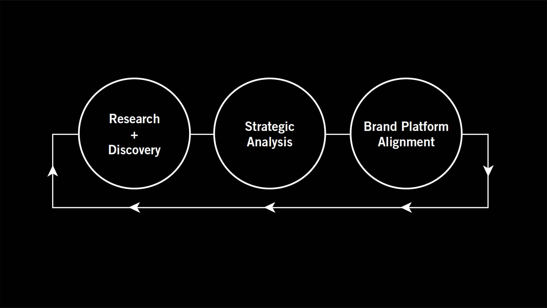
Branding is a cyclical process, not a linear one. It demands a constant re-evaluation of how your identity aligns with the future goals of the brand. That’s why working as close as we do with the Tbaytel Marketing team is such a benefit to the process.
We see the organization change as it happens, we share in communication victories and both learn from any mistakes made along the way. This sort of proximity to the client allows us to react to communication challenges quickly and more accurately.
The brand was built around a simple and powerful ideal: “We take care of our neighbourhood.”
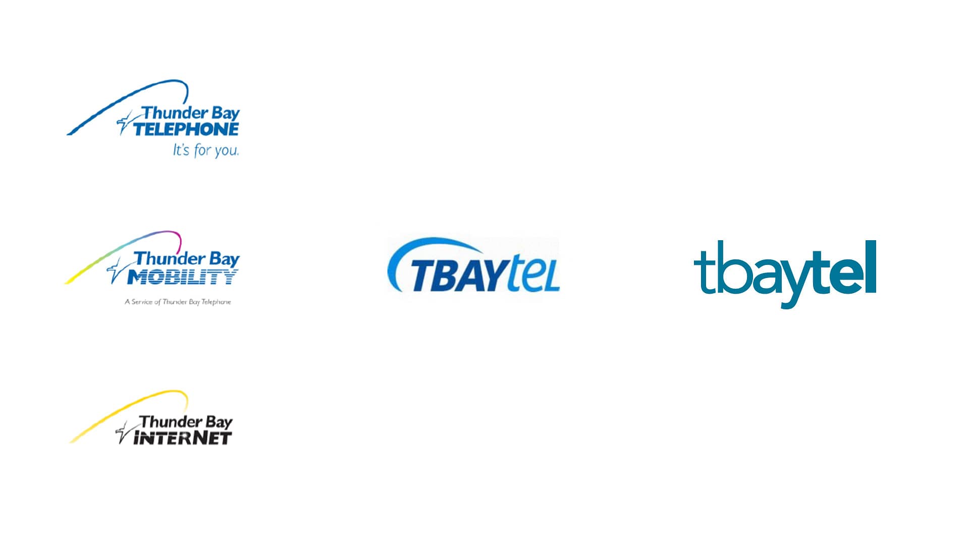
Tbaytel went through a major rebrand in 2010; the second large scale transformation Generator has helped them navigate (in fact, we were part of the original name change from “Thunder Bay Telephone” to the city adopted nickname “Tbaytel”). The task in 2010 was to develop a brand strategy that would serve as a long term backbone for the company, as well as an accompanying visual update to usher it in.
The brand was built around a simple and powerful ideal: “We take care of our neighbourhood.” A promise that Tbaytel strives to keep with everything they do. Whether it is product-based; like the introduction of Fibre Internet, a Mobility network that stays competitive with national suppliers, numerous TV innovations, or community-based; like the hundreds of thousands of dollars that are invested back into the community each year. No company of this size is ever perfect, but having a community-centric goal in mind at the heart of your organization is what it takes to grow while doing good for the world. With this ideal in mind, Tbaytel needed a visual identity that felt inspired by the community it serves…
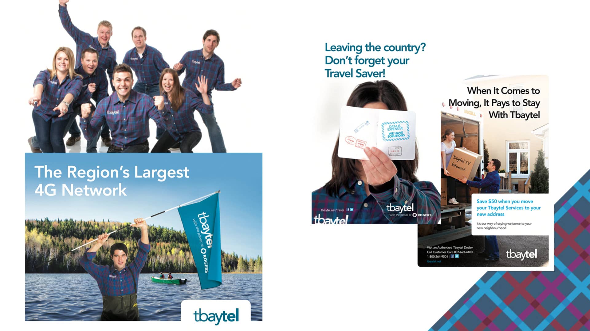
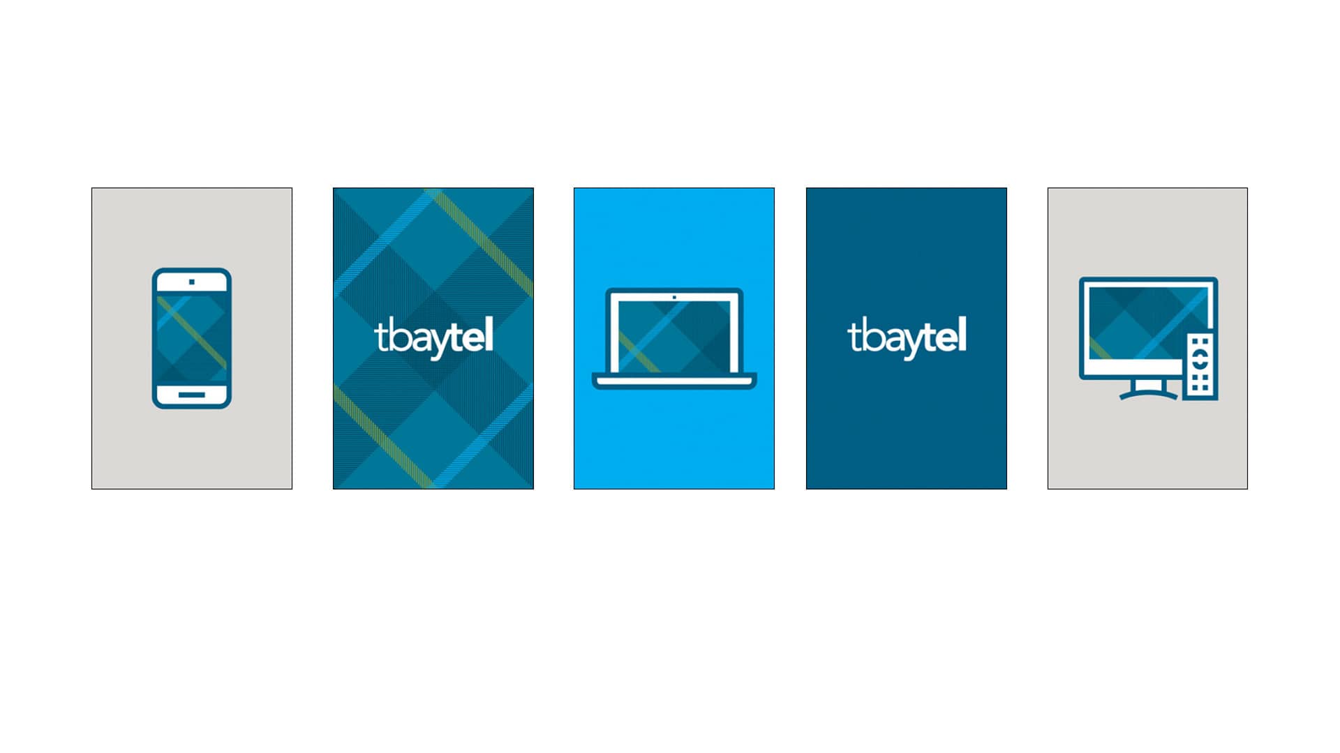
Enter the plaid.
Plaid shirts, plaid graphics, plaid everything – inspired by the favourite pattern of so many people from Northern Ontario. If the new logo was the hero then the plaid was its sidekick. When it was fresh and new it was prominent in all Tbaytel communication. But after some time the plaid identity element fell out of the spotlight; it became fatigued and dated and was eventually brought out of circulation altogether.
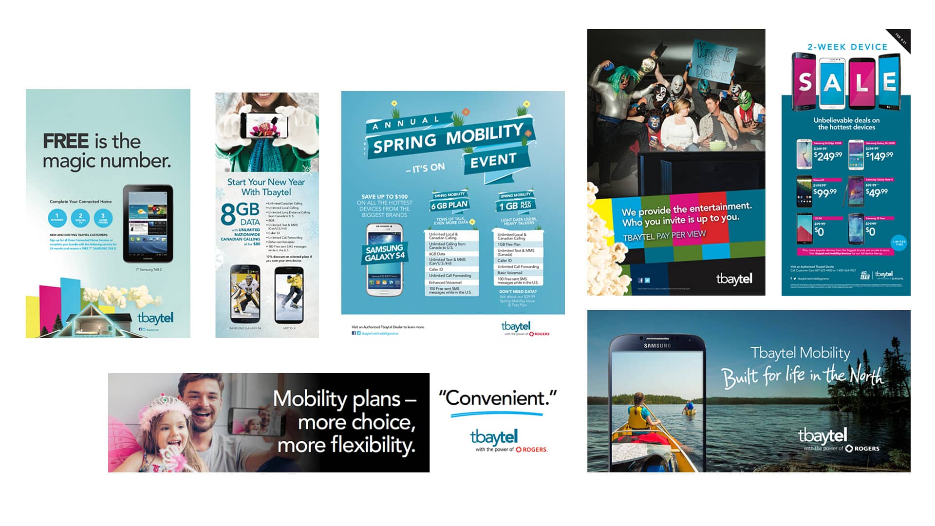


While the “post-plaid” creative concepts were strong, the overall identity was missing a common thread that ties the look together – a common problem that growing brands face. The brand’s aesthetic was addressed on a brief-by-brief basis creating more of a scattered visual language. So even though each campaign met communication objectives in their own unique way, they weren’t accumulating brand equity in the minds of customers as effectively as it could be with a more consistent and recognizable design system in place.
In 2015, Generator looked to solve this problem by evolving the current brand rather than reinventing it entirely. Years of effort had gone into establishing other elements like the logo and colour so the last thing we wanted was to undo that hard work. Instead of a rebranding entirely, we looked into the current Tbaytel toolkit to see what could be rejuvenated; we looked back to the plaid.
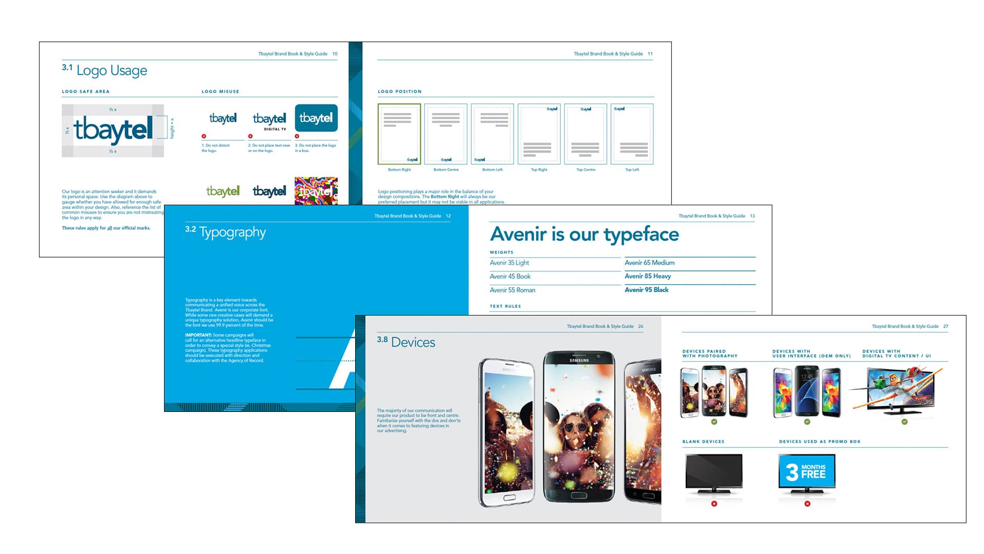

We set off to modernize the pattern that had been such a large part of Tbaytel’s look and feel and at the same time, fully standardized the brand’s visual identity to ensure it was used consistently at every customer touchpoint regardless of whether it was executed by Generator, Tbaytel’s in-house design team or other outside suppliers.
The development of the Tbaytel Style Guide was meant to create order, clarity and recognizability across all of the brand’s marketing assets and that’s exactly what it accomplished. Deployed across print, digital, motion, video, signage, clothing, vehicles and products, the system allows for flexibility where needed but maintains a “family” look that can be differentiated against any of the national providers. A recent customer study revealed that almost all participants found Tbaytel advertising to be “very recognizable and on par with the national advertisers.”

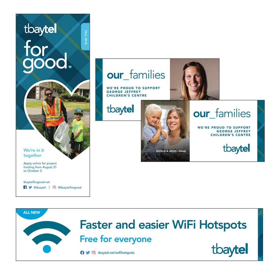
Today, the system outlined within the Style Guide continues to serve as a strong foundation, allowing the Tbaytel brand to evolve in a way that feels new, while remaining familiar. The branding process is never done. Even with a fully defined visual system in place, an identity must remain fluid, because a growing organization is always in flux. With every new initiative, product launch and campaign, the flexible design system adapts to innovate and meet fresh objectives. From the restructuring of Tbaytel’s community support arm, ‘Tbaytel For Good’ to the launch of Tbaytel 5G, the visual identity remains undeniably neighbourly and unmistakably Tbaytel.